Elements and principles are the building blocks of Art. Every artist knowingly or unknowingly uses at least two or more of these elements in their creation.
The visual tools that an artist utilizes to develop a composition are known as art elements.
The elements of art are line, color, shape, form, space, texture, and value. These visual tools guide composition, while the principles of art (balance, contrast, emphasis, movement, pattern, and rhythm) determine how these elements interact to communicate an artist’s intention.
Let us briefly discuss on what are the Elements of Art.
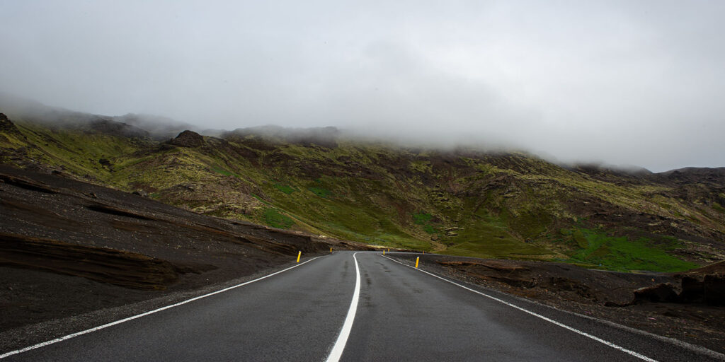
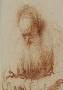
A line is the foundation in drawing art and it’s one of the seven elements of art. The basic idea to create a painting or a sculpture begins with a line. It is the starting point of a drawing, painting, or sculpture, defining shapes and forms.
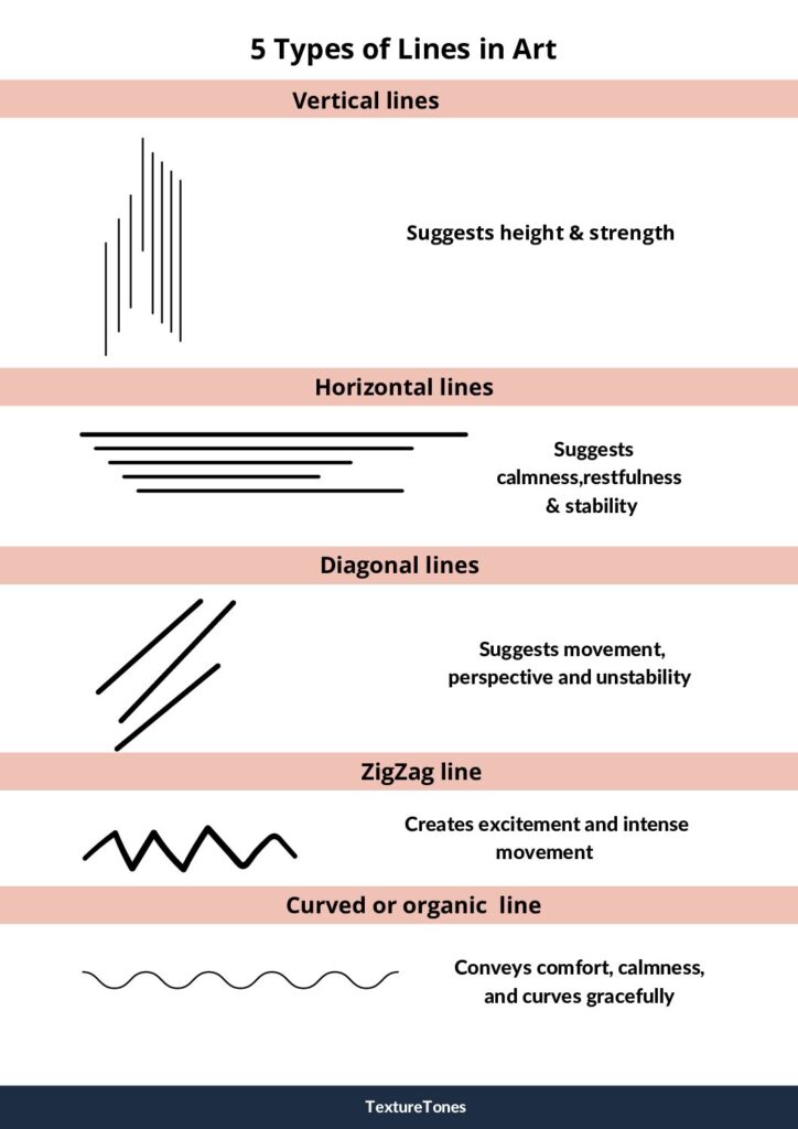
5 types of Lines in Art
- Vertical lines – These are straight lines that are perpendicular to horizontal lines.
- Horizontal lines – These are straight lines parallel to the horizon that move from left to right. Horizontal and vertical lines used in combination communicate stability and solidity.
- Diagonal lines– These lines are at an angle and it can either be an incline or decline slope. They are straight lines that slant in any direction except horizontal or vertical.
- Zigzag lines – These lines are a combination of diagonal lines that connect at points.
- Curved lines– These types of lines can either be geometric as well as organic. The arc of a circle is an example of a geometric curve. Organic curves are often associated with the natural things in the world. An example of an organic curve is the subtle curve of a human body. These lines change direction by creating a sense of gracefulness, dynamism, and spontaneity.
- Geometric lines – These are rarely found in nature but often found in man-made constructions. They have regularity and have hard or sharp edges.
Variations in Line
There are also different variations in line and all of these may differ in their length, width, weight, texture, or style in order to obtain the desired effect on a painting.
- Length in a line could be long, short, or anything in between.
- The width in a line determines how thick or thin the line is.
- Weight is a continuous change of width in your line.
- The texture of a line defines how smooth or rough the line is.
- The style of a line refers to whether it is continuous, dotted, dashed, or implied.
- Lines can also move or change the direction of art.
- Curved lines show the degree of change in the curve of a line. This can vary depending on the artwork.
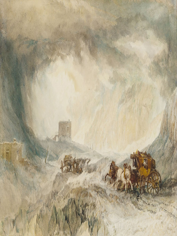
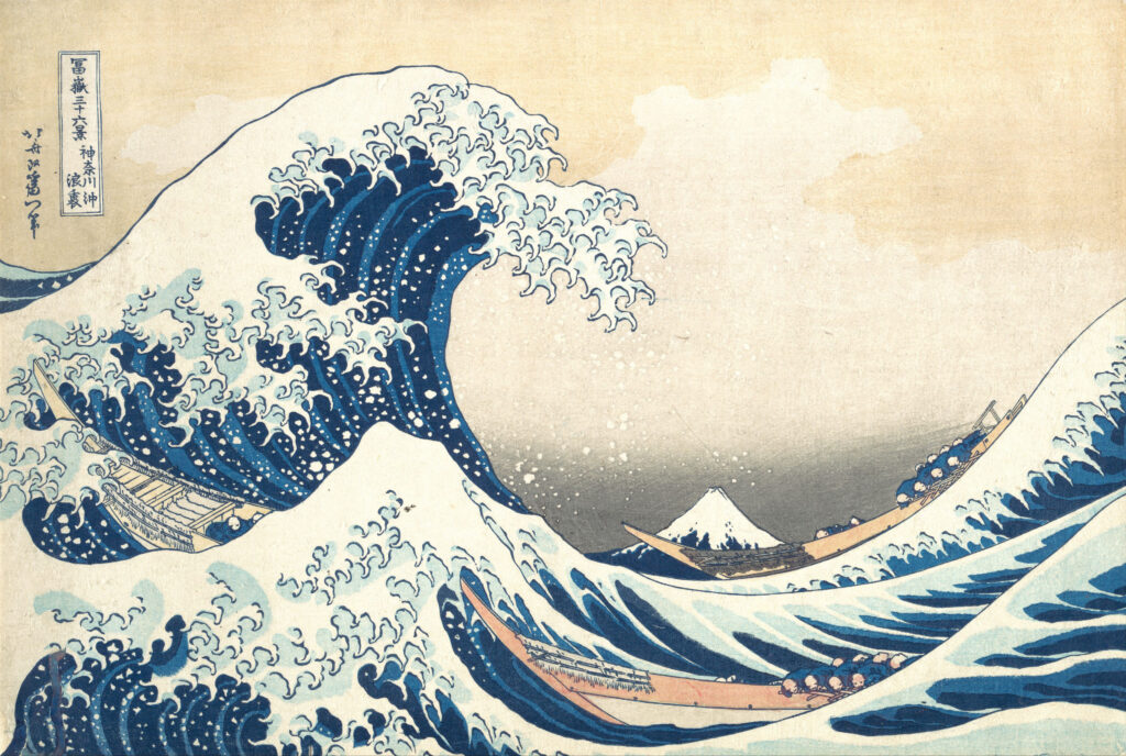
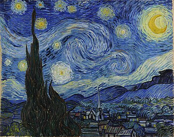
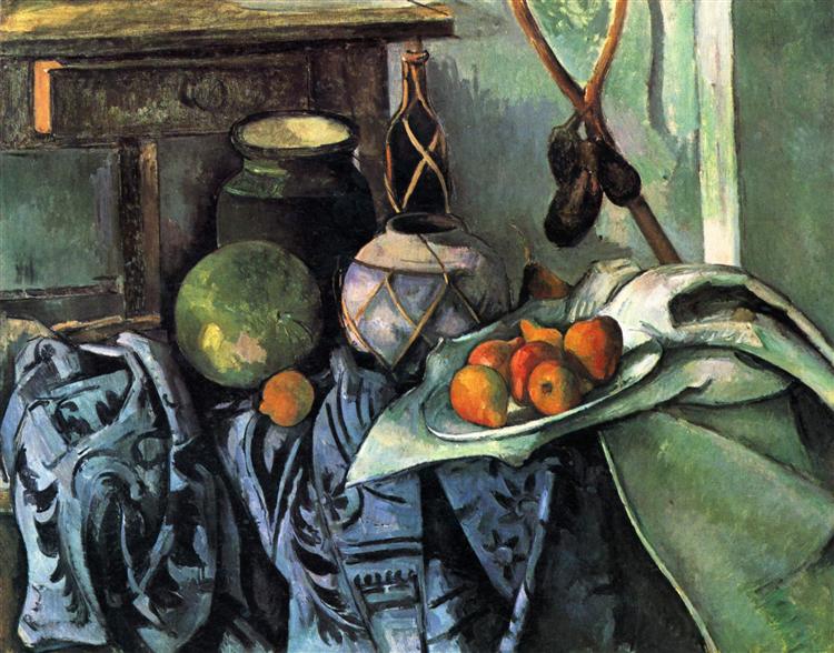
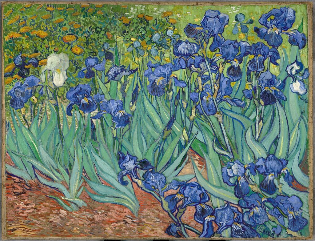
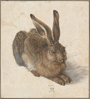
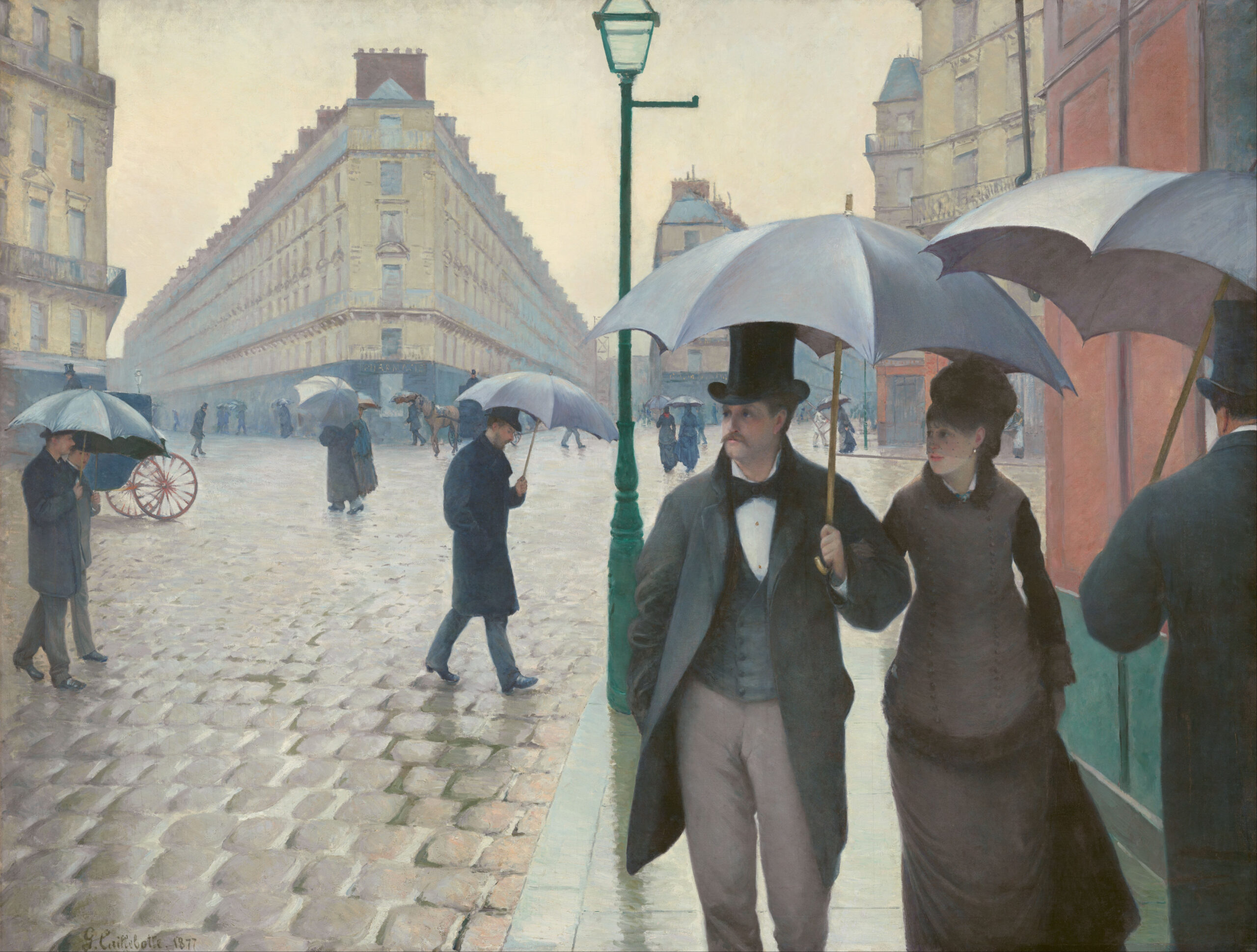
Below are some of the examples of great masters. Have a closer look to see how they have used lines in their work to create depth, movement, shape, and emphasis.
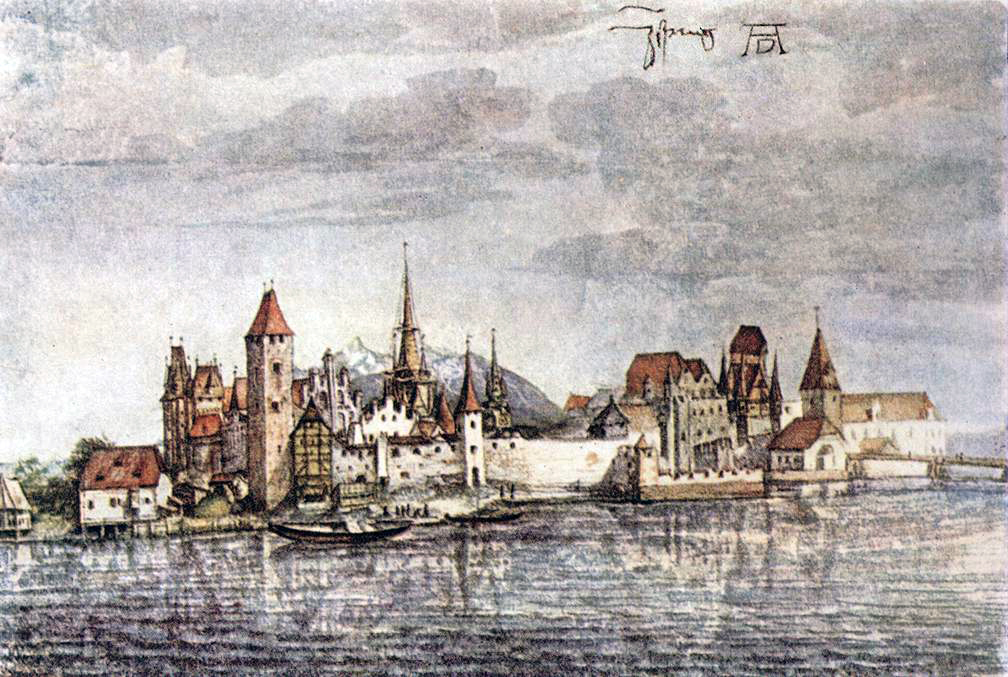
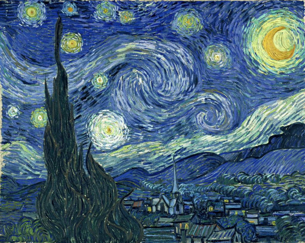
(Image source: “Wikimedia Commons”)

COLOR
Color is the appearance of things that are caused by the different qualities of light that they reflect or emit.
Properties of Color
Colors consist of three properties: Hue, Value, and Intensity or Saturation.
Hue
This is the name given to a color, where it has no tint or shade. It’s a pure pigment of a color. In other words, hue is the purest form of color.
- Tint – This is the lightness of a color . It refers to any hue or mixture of pure colors when white is added . It is paler than the original color and the intensity of the color varies depending on the white added to the hue.
- Tone – is a hue or mixture of pure colors to which only pure gray is added (equal amounts of black and white). Adding gray to color will make the intensity much duller.
- Shade – is a hue or mixture of pure colors to which only black is added. It contains no white or gray. Shade darkens the color as black is added little by little to achieve the desired color.
Value
This is the lightness or darkness of a color. It is used to make objects look three-dimensional.
Intensity or Saturation
This refers to the brightness or dullness of a color. It can also be referred to as “saturation”. When a color is at its purest form (straight from the tube) it is most intense and they are high-intensity colors. Those mixed with other colors less intense and are low-intensity colors.
Different types of colors
Studying the color wheel is a great way to understand how colors work. It is a circular chart divided into 12 sections, each representing a different color. The wheel consists of three main color categories—primary, secondary, and tertiary. It was first developed in 1666 by Sir Isaac Newton, who took the color spectrum and arranged it into a circle. Since then, both scientists and artists have explored and refined various versions of this concept.
Primary Colors
Primary colors are the foundation of all other colors because they cannot be created by mixing any other shades. Red, blue and yellow are the primary colors, and they are the base of every other color. All other colors come from mixing these three hues, making them the foundation of color theory and art.

Secondary Colors
Secondary colors are created by mixing two primary colors in equal parts. There are three secondary colors:
- Orange (Red + Yellow)
- Green (Blue + Yellow)
- Purple (Violet) (Red + Blue)
These colors sit between the primary colors on the color wheel and serve as the next step in creating a full range of hues.

Tertiary Colors
Tertiary colors are created by mixing a primary color with a secondary color next to it on the color wheel. There are six tertiary colors:
- Yellow-Orange (Yellow + Orange)
- Yellow-Green (Yellow + Green)
- Blue-Green (Blue + Green)
- Blue-Purple (Blue + Purple)
- Red-Purple (Red + Purple)
- Red-Orange (Red + Orange)

Analogous Colors
Analogous colors are three or more colors that sit next to each other on the color wheel and share a common hue. They create a harmonious, visually pleasing effect because they blend smoothly without harsh contrast. Choosing Analogous colors could give a balanced, cohesive and serene look to your painting.

Complementary Colors
Complementary colors are any two colors that are directly opposite each other, that is red and green, yellow and purple, orange and blue. When using complementary color in your painting, it is always better to pick one of the hues as your main color, then use the complementary color to highlight or to bring a certain subject as a focus.

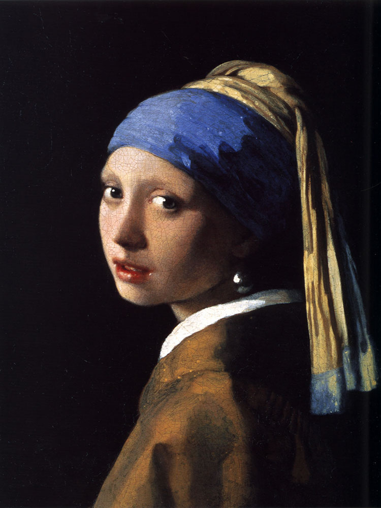
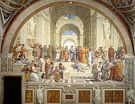
Below are some of the examples of great masters and notice how colors are used in their work.(Image source: “Wikimedia Commons”)
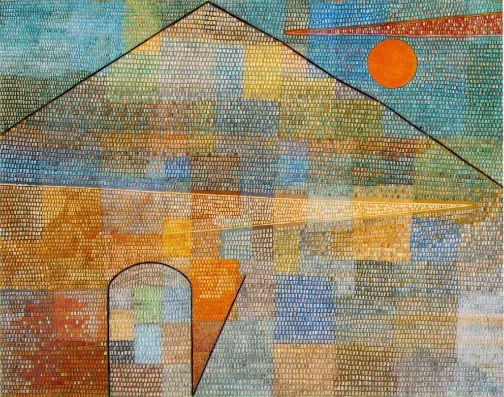

VALUE
Value is one of the seven elements of art and is the most fundamental aspect of any work. Value deals with the lightness or darkness of color and in painting.
Value refers to how light or dark a color appears. It plays a crucial role in creating depth, contrast, and mood in an artwork.
Types of Value
- High Value.
- Low Value.
What is High Value
A high-value color is a light version of a color. The closer a color is to white, the higher its value. Example: Light blue, pale yellow, or soft pink all have high value.
How to create high value – Add white to a color (this is called a tint).
What is Low Value
A low-value color is a dark version of a color. The closer a color is to black, the lower its value. Example: Deep navy blue, dark maroon, or forest green all have low value.
How to create low value – Add black to a color (this is called a shade).
Why is Value Important in Art?
Value is what makes an artwork feel three-dimensional. Without it, everything would look flat. By using different values, artists can create light, shadow, and contrast, making their paintings more lifelike and visually interesting.
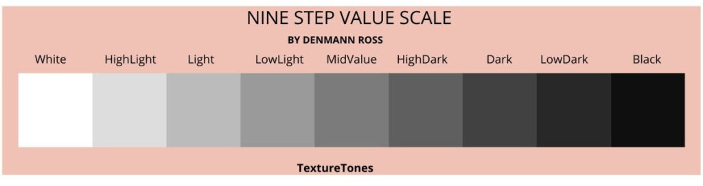
What is a Value Scale?
A value scale is a tool that shows how colors change from light to dark in a series of steps. It helps artists understand shading and contrast, making their artwork look more realistic.
The scale usually starts with white, moves through different shades of gray, and ends with black. Some value scales also show how colors become lighter (tints) or darker (shades) by adding white or black.
One of the most well-known ways of describing how values change between white and black is the Denman Ross nine-step value scale. The scale was developed by Denman Ross in 1907 and has since been adopted as a standard for describing value gradations. The dark squares are shades, the middle squares are mid-tones the lighter squares are tints.
You use these values in your painting or drawing to get depth, dimension, and contrast.
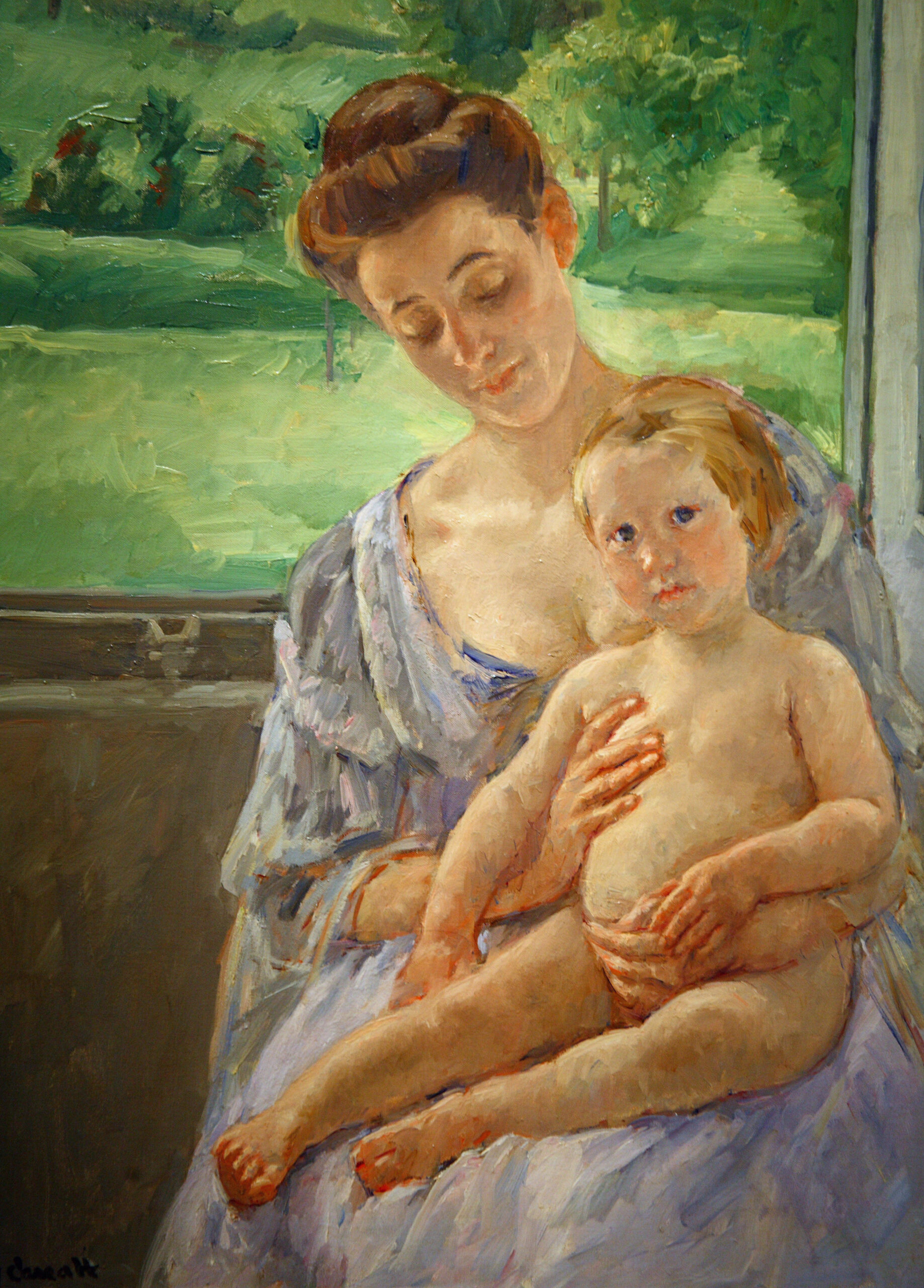
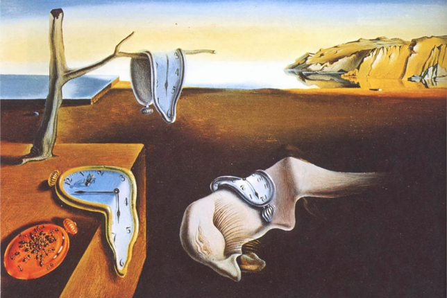
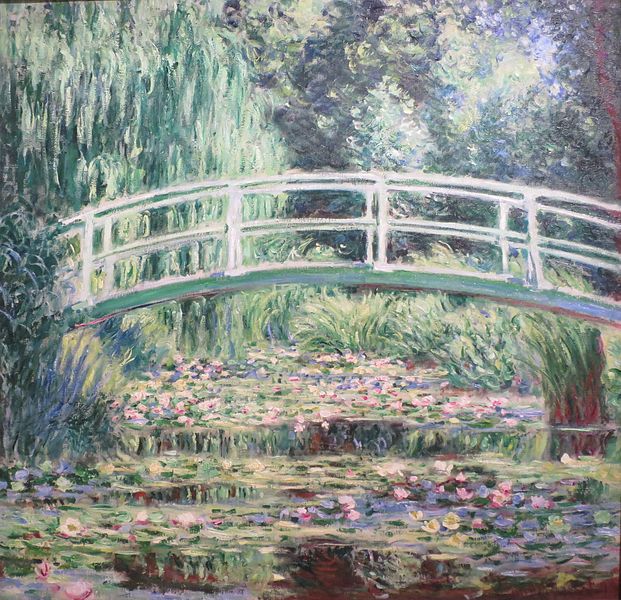
Adding value helps create the illusion of light in specific areas of a subject. Observe how the great masters in the paintings below have skillfully used color to enhance depth and dimension through value.
(Image source: “Wikimedia Commons”)
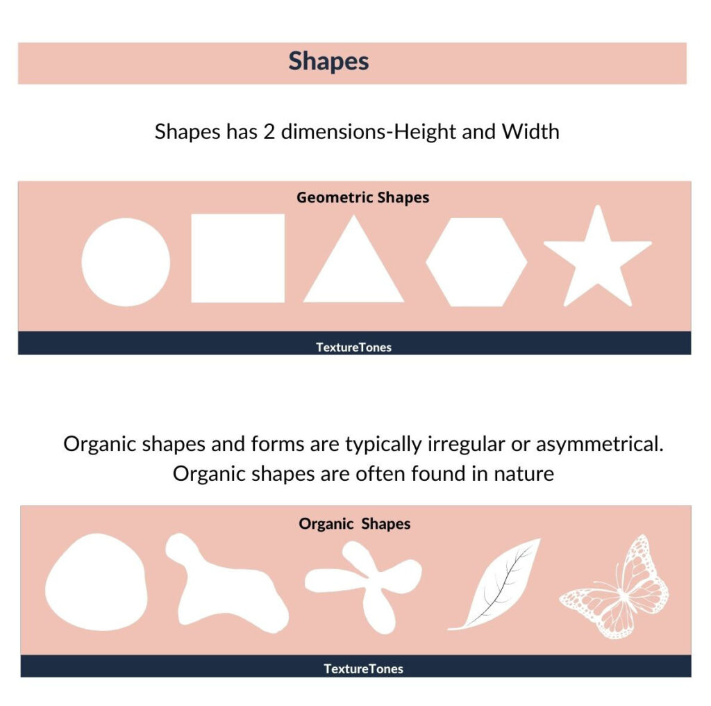
SHAPE
Shape is any flat (2D) area that is enclosed by lines, colors, or textures. Shapes have height and width but no depth. Everything we see in art is made up of different shapes.
Types of shapes
- Geometric shapes.
- Organic shapes.
Geometric shape
A geometric shape is a simple, precise shape .These shapes can be measured clearly and has clear edges and angles. Examples of geometric shapes include circles, squares, triangles, rectangles, and hexagons.
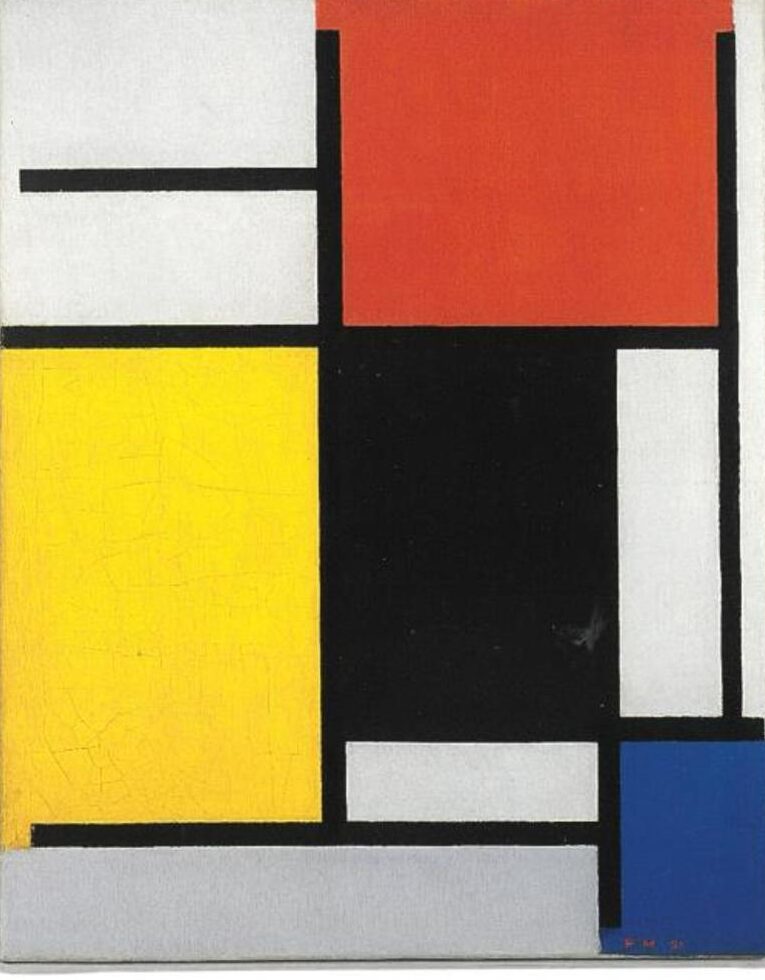
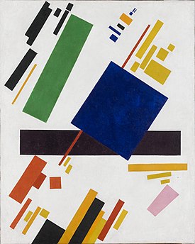
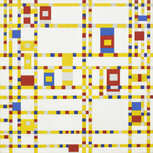
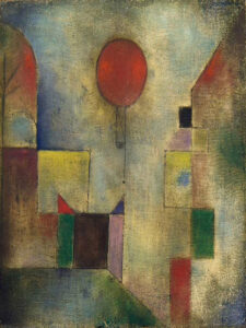
Examples of Geometric Shapes in Famous Paintings

Organic shapes
An organic shape is a shape that looks natural, free-flowing, and uneven. They are curvy, irregular and often found in nature. They do not have like geometric shapes.
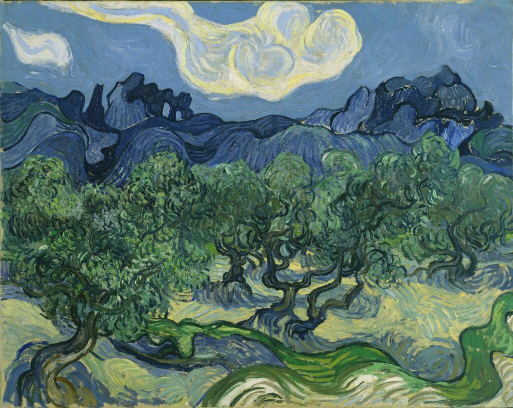
Examples of Organic shapes in Famous Paintings
Here are few other examples:
(Image source: “Wikimedia Commons”)

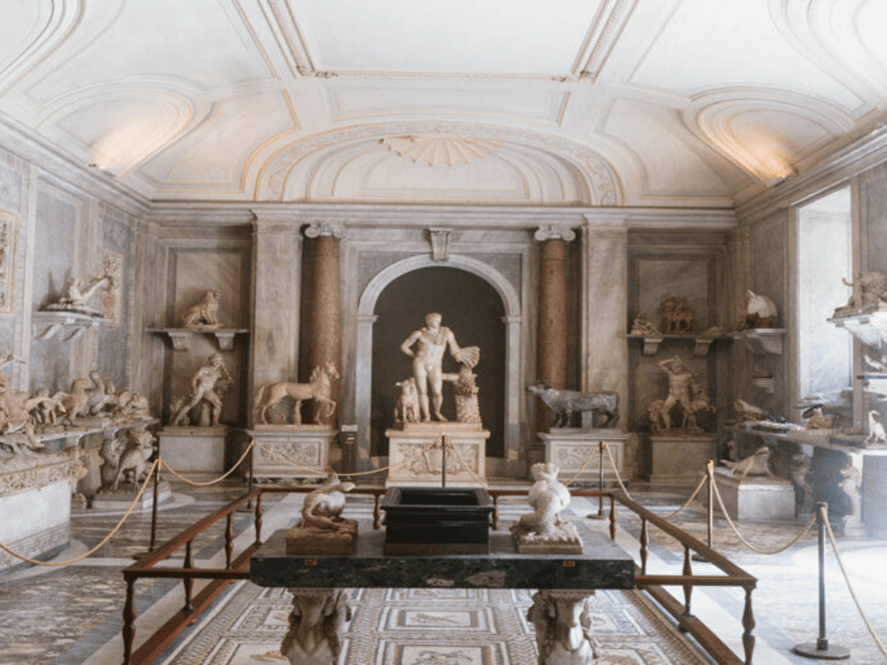
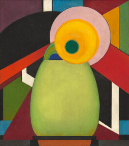
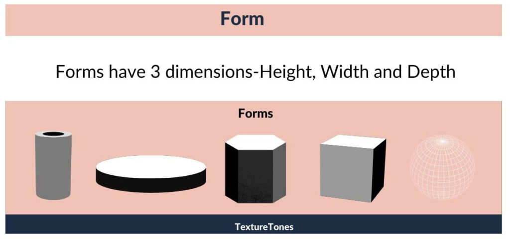
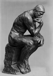
FORM
Form is what turns flat shapes into something that appears three-dimensional. It’s the difference between drawing a circle and shading it to look like a round, juicy orange. While shape is flat (2D), form has depth, width, and height, making objects look solid and real.
If you ever felt the urge to grab the orange seen in a painting, that is because of form. By using form, the artist makes the orange look solid and real, creating the illusion of depth for the viewer.
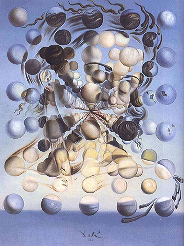
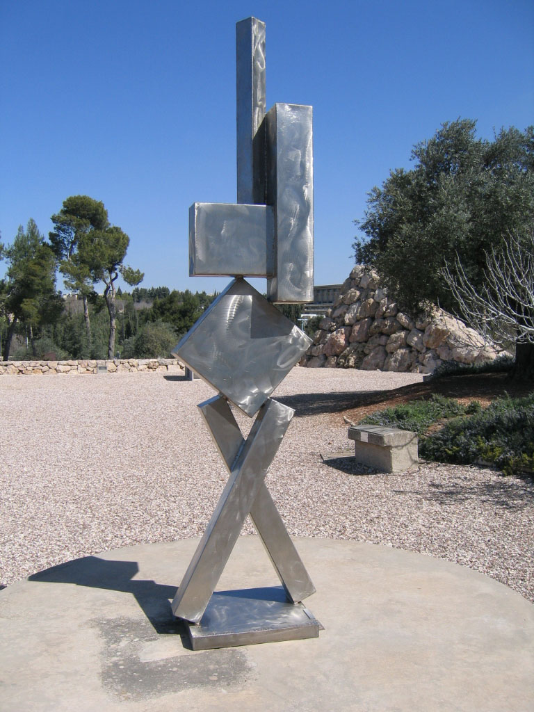
Types of Forms
- Geometric Forms
- Organic Forms
Geometric Forms
These have clear, mathematical structures, like cubes, spheres, cones, and cylinders. They are often used in still-life paintings, architecture, and abstract art.
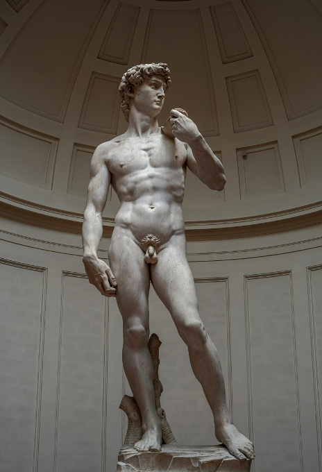
Here are few examples of geometric forms in famous artworks

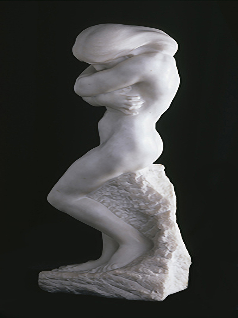
Organic Forms
These are irregular, free-flowing, and often inspired by nature. They can be soft, curvy, or unpredictable, like clouds, waves, or the human body.
Here are few examples of Organic forms in famous artworks
In simple words, when a shape acquires depth and becomes three-dimensional, it takes on form.
Here are few other examples of artists who have used forms in their work.
(Image source: “Wikimedia Commons”)

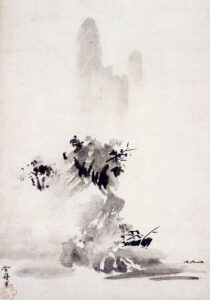
SPACE
Space is another element of art where it refers to the distance between and within the other elements such as shapes, forms, colors, and lines, as well as the area around and within them.
Space can be used to make objects appear close or far away, large or small, and flat or three-dimensional.
Types of spaces
- Positive Space
- Negative Space
- Deep Space
- Shallow Space
Positive space
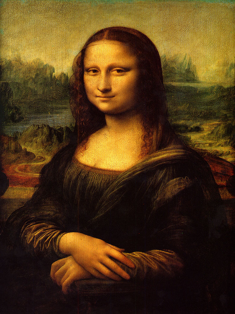
The positive space in an artwork is often the first thing that the audience notices. In other words Positive Space is the Subject of the Artwork. This is the main object or person in the painting.
Example: In “The Mona Lisa” by Leonardo da Vinci, Mona Lisa herself is the positive space because she is the focus of the painting.

Negative space
This is the empty space around or between objects. It helps define the subject and creates balance.
Here are a few examples of master artists. The area where the subject occupies is the positive space and everything around the subject is the negative space.
(Image source: “Wikimedia Commons”)
Deep Space
This makes things look far away, giving a 3D effect. Artists use size, perspective, and color to create this illusion.
Example: In “The Last Supper” by Leonardo da Vinci, the walls and ceiling lines go towards a single point in the background, making the room look deep and real. This technique is called linear perspective.

Shallow Space
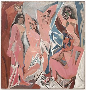
This means there is little to no depth. The objects all seem close to the surface of the painting. Example: In Pablo Picasso’s “Girl Before a Mirror”, the objects and people look flat. There is no real sense of distance or depth seen here.

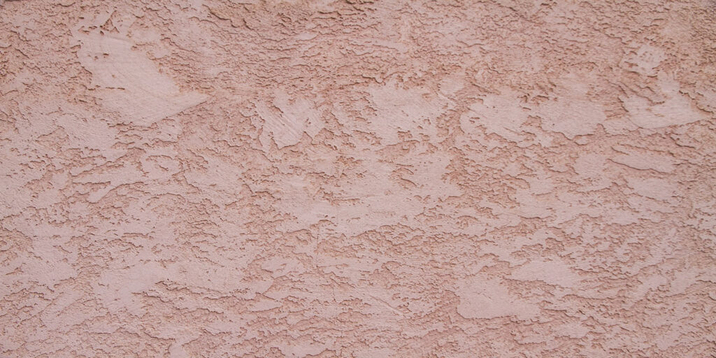
TEXTURE
The texture is a fundamental element in many pieces of art. Texture refers to how a surface feels or appears to feel. It can be smooth, rough, bumpy, soft, or hard. Artists use texture to make their work more realistic, expressive, or interesting.
Two types of Textures
- Actual Texture
- Simulated Texture
Actual Textures
The physical surface of an artwork or design is referred to as actual texture or physical texture.
The materials used by the artists determine the texture of the art, whether it is rough, silky, shiny, coarse, or smooth.
It is the sensation you would receive if you could run your hand over a piece of art. It exists in sculptures, mixed media, and heavily painted surfaces.
Here are some of the actual textures by the master artists.
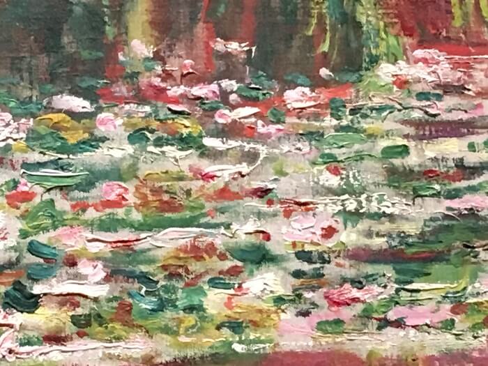
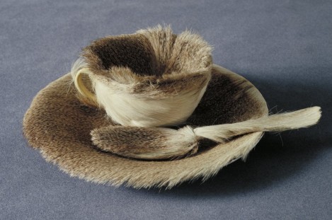
(Image source: “Wikimedia Commons”)
Simulated Textures
Simulated textures or visual textures are not real textures. This is an implied impression of texture created by the artist using numerous artistic components like line, shading, and color which creates an illusion of texture. If you would run your hand on these paintings, they would be smooth and flat.
Here are some of the simulated textures by the master artists.
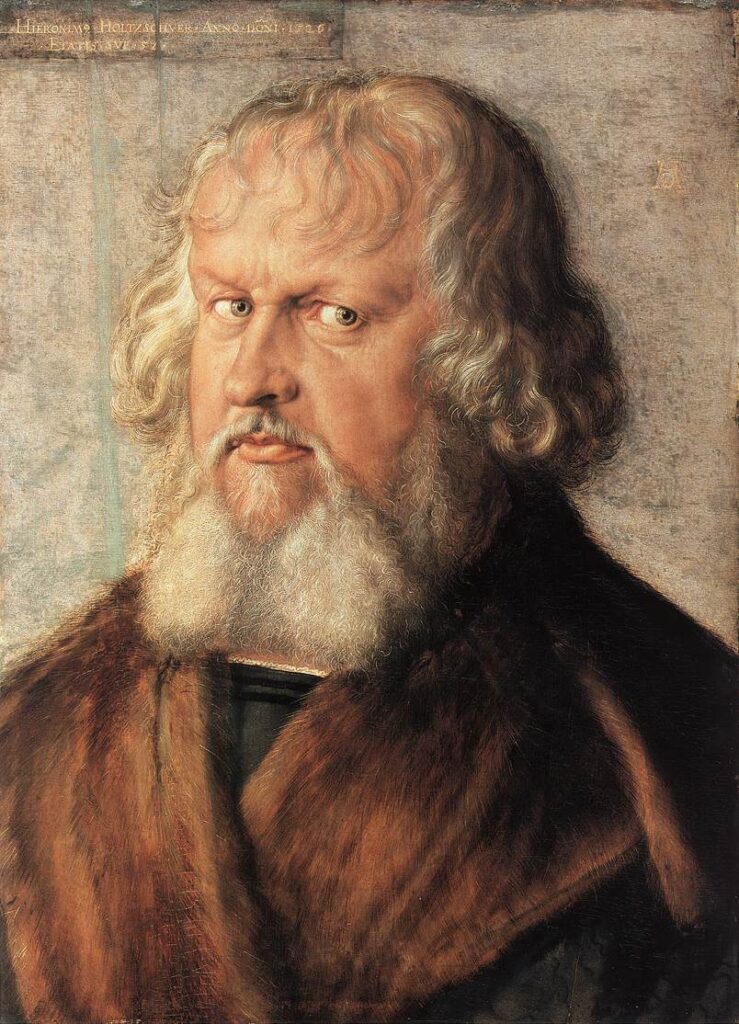
(Image source: “Wikimedia Commons”)
In conclusion, the seven elements of art—line, shape, form, space, color, value, and texture—are what give life to every piece of art. They are the tools artists use to express their ideas and emotions.
So next time you look at a painting, sculpture, or design, take a moment to observe how these elements come together—it might change the way you see art forever!
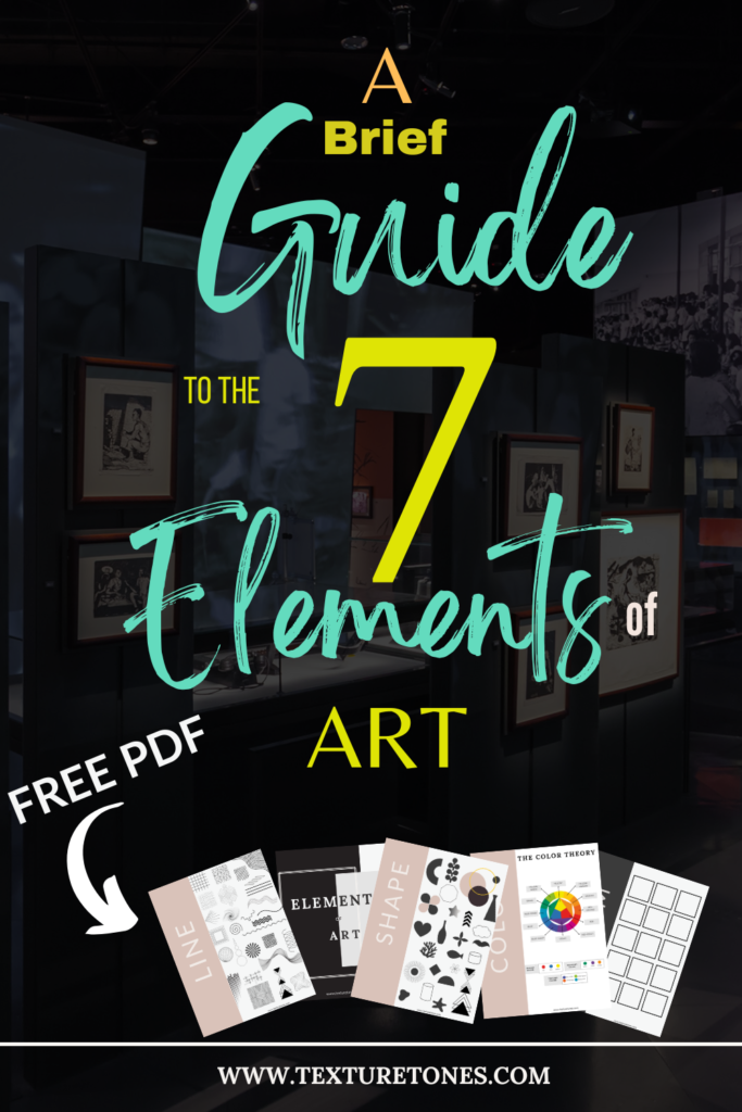
Here is your Free download to a visually engaging and concise guide that introduces the 7 essential elements of art!